Creating react-styleguide
December 30, 2014
One thing that more web developers should do when building a website is create a styleguide — even if it is only internal. It is great documentation for the developer and their team, it can be made a deliverable for the client, and makes returning to projects much simpler even if she is not the original developer. KSS is a great way of creating an organized styleguide baked in right into the CSS as you go. It uses the comments to not only give you a good styleguide at the end but to force the developer to comment their work.
While all these are undeniably great benefits, realistically it can be difficult to create these as you go. It requires more setup at the beginning of the project and more overhead as you develop. For all those using React.js, I am proposing a simple solution that will automatically create a styleguide out of your components and will require much less overhead to integrate. The component is called react-styleguide.
react-styleguide
The component was intentionally made simple to allow flexibility for varying projects, and was inspired by material-ui. The way it works is by including a new component in your project and providing it with the correct children to fill out your styleguide. The following is the example provided on Github.
var React = require('react');
var Styleguide = require('react-styleguide');

// If you would like to include Prism.js as the syntax highlighter
var Prism from '../demo/vendor/prism.js';

// Require the components that you want to include
import Button from './examples/Button.js';
import Blockquote from './examples/Blockquote.js';

var Component = React.createClass({
  render: function() {
    <Styleguide title="Example Project Styleguide">
      <div
        title="Blockquote"
        description="Here is a description describing a simple Blockquote component and how to use it."
        example='<Blockquote
text="Lorem ipsum dolor sit amet, consectetur adipiscing elit. In nec imperdiet ligula."
speaker="Mauris porta ac lectus" />'
      >
        <Blockquote text="Lorem ipsum dolor sit amet, consectetur adipiscing elit. In nec imperdiet ligula." speaker="Mauris porta ac lectus" />
      </div>

      <div
        title="Button"
        description="Here is a description describing a simple Button component and how you would use it."
        example="<Button />"
      >
        <Button />
      </div>

      ...

    </Styleguide>
  }
});
As you can see, you have to require the components that you would like to
include, and then create a div for each of the sections of your styleguide.
These children take in several props: title, description, and example.
Within these divs, you then provide the actual code to be rendered in the
styleguide. This should be the same as the example prop. Unforunately, I was
not able to come up with a solution to have the rendered components appear in
string form in the rendered styleguide. If you have any ideas, please email
me or submit a pull request.
The resulting HTML is very simple and easy to style, but default styling as been included if you like. You must just
- include Open Sans font from Google web fonts
- include the
prism.jsfile located indemo/vendor - include the
main.cssfile located indist
The resulting styleguide should look like the following after it is rendered.
{<1>}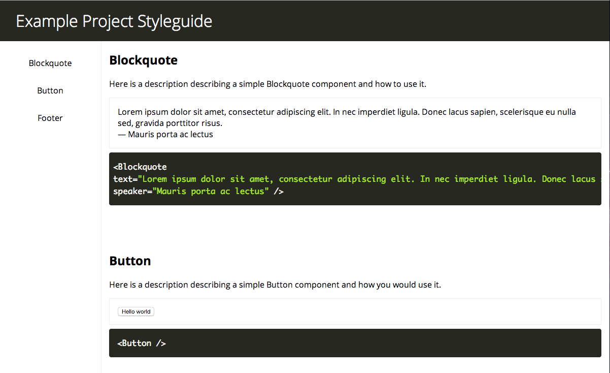
If you decide to style it yourself, please view the scss/main.scss file for more direction.
--- The file is currently available on npm and can be installed using
npm install react-styleguideIf you would like to contribute or find any issues, please refer to the repository or feel free to get in contact with me.
Written by Joseph Furlott who lives and works in Brooklyn, New York. I am a software engineer that specializes in designing and building web applications using React. I work at Datadog as a software engineer.